Audio visualization
Update 05/02/14 - This demo got featured on Google’s Chrome Experiments website! This has generated a lot more interest (as in hundreds of views per day rather than one or two per week) so hopefully we will see some improvements from the community via the GitHub repo - I’ve already had a first pull request adding some very cool new functionality!
Update May 2015 - As of latest versions of Chrome (42+) and recent versions of Firefox, changes in the way cross-origin audio is handled mean this demo may not work. It’s a well-known issue for everyone who’s used the SoundCloud API for JavaScript visualizations (there are a lot of us). I’m working on a new project to bring this (and many other) JS/Canvas visualizations onto your computer, allowing you to visualize the output of your sound card directly and thereby bypassing all the problems associated with streaming over the internet. Watch this space…
After attending meeting of the Vienna JS usergroup last year, I got inspired to check out a couple of web technologies that I had theretofore no experience with: the element and the web audio API.
I don’t intend to give an in-depth tutorial on how to use these technologies - there are already plenty of good write-ups out there. Instead, I just want to share some basic pointers for further study, a few things that I found interesting, and an example of what I was able to build with canvas and web audio. Here are a few resources that I found particularly useful in getting started:
- MDN Canvas Tutorial
- Getting Started with Web Audio API
- Intro to WebAudio
- Web Audio API chapter on analysis and visualization
Turning Sound Into Numbers
Visualizations are all about transforming a non-visual form of data into a visual form. With audio data, a simple transformation might be to represent the volume as a number between, say, 0 and 255. A loud sound would be closer to 255, and a quieter sound closer to 0. Once we have the audio data in the form of a number, we could assign it to a variable and use it to, for example, draw a vertical black bar in our <canvas> element, with a height proportional to our volume value. The canvas code would look something like this:
ctx.fillRect(0, 0, 10, volume);
This would be a simple example of an audio visualization. If this volume value was being updated in real-time, then we would be able to build an impressive visualization. However, instead of simply altering the height of a rectangle, we could do any number of transformations using just this single value representing the volume. For example, we could use it to specify colours, rotations, movements on the canvas - the only limit would be your imagination.
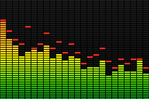
Now let’s take it one step further and imagine that, rather than getting a single value representing the volume of our audio source, we could somehow get an array of values, each one representing the volume of the sound across a whole range of frequencies. So, for example, a deep bass drum sound would give us larger values towards the lower end of the range, whereas a crash cymbal would give large values mainly at the upper end of the range. You have seen such data visualized many times before, I would guess (come on - who grew up with WinAmp?):
Example of a simple visualization
Helpfully, the web audio API has a built-in feature that allows us to extract just such a set of data from an audio source. It is known as an Analyser Node. This interface allows us to get a real-time snapshot of the audio data. I’ll not go into depth on how to implement it, but the important thing to know is that we can use it to get an array of integers from 0 - 255, each representing the relative volume of the sound at each frequency band, from low to high. Here is a nice, simple example of the kind of thing you can do with this data. Note that in learning about the web audio API, you will start to run into the term “fast Fourier transform” or FFT. Feel free to read up on it, but it can seem awfully complex to the uninitiated (like me). It’s enough to know that it is a name for a method used to get frequency data from a signal such as our audio source.
Getting Audio Data from Soundcloud
If you don’t already know, Soundcloud is sort of like YouTube, but for audio rather than video. It provides a rich API for building apps that use its audio streams, so I decided to use it as the source for my visualization (note that you’ll need to register your app to use the Soundcloud API - it’s free and straightforward to do).
To do this, I put an element in the page, and used JavaScript to dynamically set the source attribute (src="....") of that audio element to the location of the Soundcloud audio stream. Once you have a working audio element that plays sound, you can hook it up to the web audio API by using audioContext.createMediaElementSource(audioElement); If you are anything like me, you’ll probably have to do a fair bit of reading through blogs and source code in order to get everything working right. I’ll offer you a snippet of the code that I use in my demo app to get audio data from Soundcloud and into a useful array of numbers:
var SoundCloudAudioSource = function(audioElement) {
    var player = document.getElementById(audioElement);
    var self = this;
    var analyser;
    var audioCtx = new (window.AudioContext || window.webkitAudioContext); // this is because it's not been standardised accross browsers yet.
    analyser = audioCtx.createAnalyser();
    analyser.fftSize = 256; // see - there is that 'fft' thing.
    var source = audioCtx.createMediaElementSource(player); // this is where we hook up the <audio> element
    source.connect(analyser);
    analyser.connect(audioCtx.destination);
    var sampleAudioStream = function() {
        // This closure is where the magic happens. Because it gets called with setInterval below, it continuously samples the audio data
        // and updates the streamData and volume properties. This the SoundCouldAudioSource function can be passed to a visualization routine and
        // continue to give real-time data on the audio stream.
        analyser.getByteFrequencyData(self.streamData);
        // calculate an overall volume value
        var total = 0;
        for (var i = 0; i < 80; i++) { // get the volume from the first 80 bins, else it gets too loud with treble
            total += self.streamData[i];
        }
        self.volume = total;
    };
    setInterval(sampleAudioStream, 20); //
    // public properties and methods
    this.volume = 0;
    this.streamData = new Uint8Array(128); // This just means we will have 128 "bins" (always half the analyzer.fftsize value), each containing a number between 0 and 255.
    this.playStream = function(streamUrl) {
        // get the input stream from the audio element
        player.setAttribute('src', streamUrl);
        player.play();
    }
};
Here is an example of how you might use it:
// assuming something like this in your HTML:
<canvas id="canvas" width="300" height="200"></canvas>
<audio id="player"></audio>
var audioSource = new SoundCloudAudioSource('player');
var canvasElement = document.getElementById('canvas');
var context = canvasElement.getContext("2d");

var draw = function() {
    // you can then access all the frequency and volume data
    // and use it to draw whatever you like on your canvas
    for(bin = 0; bin < audioSource.streamData.length; bin ++) {
        // do something with each value. Here's a simple example
        var val = audioSource.streamData[bin];
        var red = val;
        var green = 255 - val;
        var blue = val / 2;
        context.fillStyle = 'rgb(' + red + ', ' + green + ', ' + blue + ')';
        context.fillRect(bin * 2, 0, 2, 200);
        // use lines and shapes to draw to the canvas is various ways. Use your imagination!
    }
    requestAnimationFrame(draw);
};

audioSource.playStream('url_to_soundcloud_stream');
draw();
Making It Look Cool
Okay, so that will hopefully give you a few ideas about how to get started. The real fun (at least for me) comes in actually making your visualization. Now that you have the raw data to work with, the sky is the limit. Here are some ideas of things you can do with the audio data:
- Dynamically set colours (as in the example above)
- Dynamically resize shapes
- Set the rotation of shapes
- Set the position of shapes
- Deform shapes by moving their vertices in different ways
Combinations of the above, when thoughtfully combined, can produce stunning visuals.
Re-Learn Trigonometry
One thing I quickly discovered, once I moved beyond the most basic of visualizations, was that I needed to use a lot of trig. This is because the trig functions sine and cosine allow you to input any changing number (such as is produced by the analyser node) and transform it into a smoothly-changing number between 1 and -1. By further transforming this result, you can achieve more natural and fluid transitions. The other reason that trig is vital in using canvas is that you can use it to calculate coordinates in 2D space (as in canvas), which is necessary if you want to do any sort of complex rotation or movement.
Since I’ve not really used it much since college, I needed to swot up on my SOHCAHTOA. One really useful resource that I used a lot was the Desmos graphing calculator. This is a beautiful app in itself, and I found it helped me to visualize my calculations and test out new ideas before having to write all the code. Just type ‘sin x' and watch the magic happen.
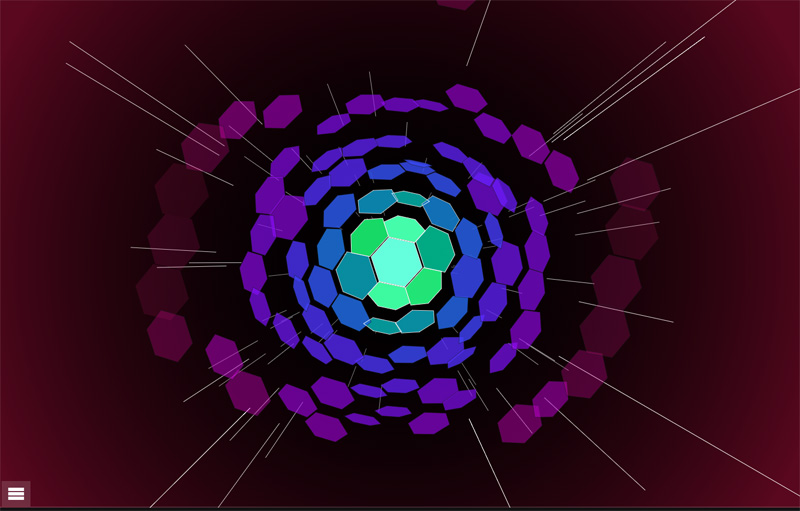
Demo
Here is a demo of the app that I built. The visualization is fairly complex compared to my example above - it uses three cavases overlayed one on top of the other, and there are transformations of colour, size, rotation, and skew all going on at once. However, I just started simple and built up the complexity one bit at a time. It’s a lot of fun and a good opportunity to experience some less well-trodden areas of JavaScript and web development.
Source
The source is all on GitHub, check it out to see how the demo works, and see some of the more advanced techniques I used.