I’ve recently been having lots of fun with CSS 3D transforms and animations. As part of a demo for a talk I am giving at the ViennaJS meetup group this month, I put together a demo that showcases how some fairly sophisticated 3D effects can be achieved with pure CSS, and made interactive with a little JavaScript.
_Note: The 3D effect is not currently supported by Internet Explorer. _
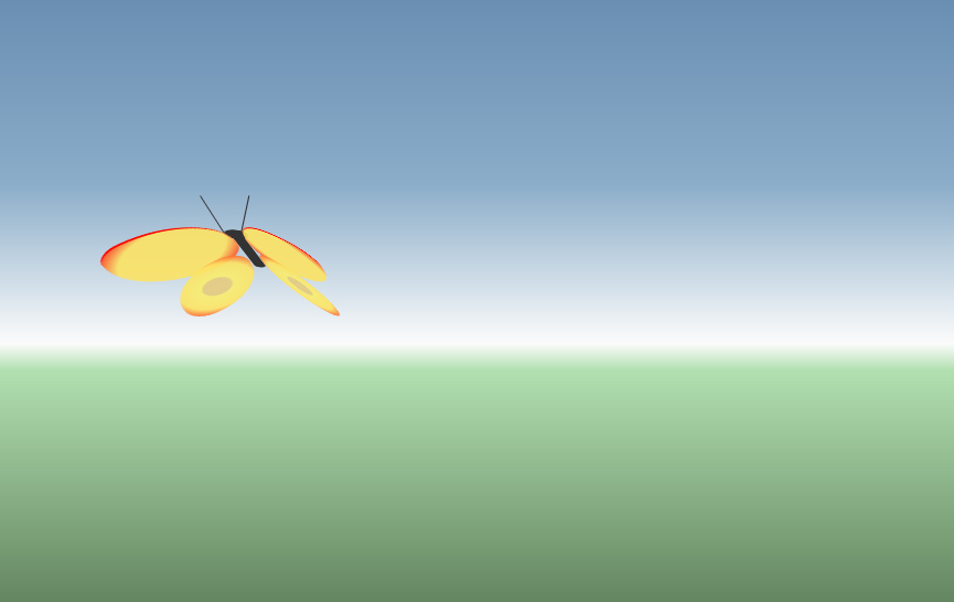
CSS 3D Butterfly Demo
The Markup
Here is the entire HTML code for the butterfly:
<div class="container">
    <div class="hover-container">
        <div class="left wing"></div>
        <div class="right wing"></div>
        <div class="body"></div>
        <div class="head"></div>
    </div>
</div>
- The
.containerdiv is as it sounds - it contains everything and it is the div that gets moved around the screen, causing the whole butterfly to move. - The
.hover-containerdiv is responsible for the constant erratic motion of the butterfly. - The
.wing,.bodyand.headdivs make up the butterfly itself. I make use of the pseudo-elements:beforeand:afterto make more complex shapes out of single divs (explanation) - e.g. the front and back part of each wing, or the.headdiv with two antennae.
Here is the flat, un-animated version of the butterfly:
The CSS
The overall effect is achieved with a combination of CSS transitions and CSS animations. Transitions are used for the movement of the butterfly around the screen, following the mouse clicks. Animations are used for the flapping wings and the erratic motion of the butterfly when at rest. The flapping wings effect is achieved by animating the rotation of each wing about the y axis. We also need to make sure we set the transform-origin to one side, otherwise the wings would see-saw about the center, rather than flapping. Here are the relevant excerpts of CSS - the styling is omitted, only the rules relating to the animation of the wings are shown:
@keyframes flap {
    0% {
        transform: rotateY(80deg);
    }
    100% {
        transform: rotateY(-80deg);
    }
}
body {
    perspective: 1500px;
    transform-origin: center center;
}

.container {
    transform: rotateX(90deg);
    transform-style: preserve-3d;
}

.hover-container {
    transform-style: preserve-3d;
}

.wing {
    position: absolute;
    transform-style: preserve-3d;
    animation: flap 0.3s linear infinite alternate;
}
.left {
    transform-origin: right center;
    border-radius: 177% 50%;
}
.right {
    transform-origin: left center;
    border-radius: 50% 177%;
    left: 110px;
    animation-direction: alternate-reverse;
}
A couple of things to note:
- We set the
perspectiverule on the body element. This establishes a common 3D space for all the elements below it. In order to “pass a reference” to that common 3D space down, the.containerand.hover-containerdivs both include the transform-style: preserve-3d rule, ensuring their child elements have a common perspective when having 3d transformations applied to them. - Although both the left and right wing use the same flap animation, the animation needs to be mirrored. This is achieved by setting the
animation-direction: alternate-reverse;rule on the right wing.
Here is what the butterfly looks like with the 3D perspective applied, and the wings animated:
Following The Mouse Clicks
This is where some JavaScript is needed, but only to set a few CSS values, which are then animated with CSS transitions. The .container div has the following CSS transition rules defined:
.container {
    transition:
        top 3s cubic-bezier(.34,.63,.26,.94),
        left 3s cubic-bezier(.34,.63,.26,.94),
        transform 1s linear;
}
What this means is that if we change the top or left values of the container, it will transition to the new position over the course of 3 seconds, following a timing function specified by the cubic-bezier function (this one makes it accelerate rapidly, and very slowly come to a stop). This is used to move the butterfly around the screen.
At the same time, we will transition any transforms more quickly, following a linear timing function. This is used to rotate the butterfly towards the point where the mouse clicked. Another transform causes the butterfly to move towards and away from the screen (by adjusting its position on the z axis).
Here is a simplified version of the JavaScript code that sets these dynamic CSS values based on mouse clicks:
document.addEventListener('click', moveTo);
var container = document.querySelector('.container');

function moveTo(e) {
    var currentX = parseInt(container.style.left, 10);
    var currentY = parseInt(container.style.top, 10);
    var newX = e.clientX - butterflyWingspan;
    var newY = e.clientY;
    var deltaX = newX - currentX;
    var deltaY = newY - currentY;

    var rotateZ = -Math.min(Math.max(deltaX / rotationDamping, -90), 90);
    var rotateX = 90 - Math.min(Math.max(deltaY / rotationDamping, -90), 90);
    var translateZ = newY - 500;

    container.style.left = newX + 'px';
    container.style.top = newY + 'px';
    container.style.transform = 'translateZ(' + translateZ + 'px) rotateX(' + rotateX + 'deg) rotateZ(' + rotateZ + 'deg)';
}
Reading the code from the top of the moveTo function, here is what is happening:
- We get the current position of the butterfly by querying the container’s left and top style properties.
- We get the coordinates of the mouse click.
- We work out the delta (difference) between the two sets of coordinates. This is used to set the 3D rotation of the container. The greater the delta, the more the container is rotated on that axis. We also use the y position of the click to determine how “close to the screen” the container is placed on the z axis. A click near the top of the screen sends the container further back; near the bottom brings it closer.
- We use the container’s style object to set the inline CSS of the element, which will trigger the transitions to the new values.
To make this easier to understand, here is a demo which uses the above principles, but with a simple 3D square rather than a butterfly:
Conclusion
CSS, while often a source of frustration for the front-end developer, is nonetheless a powerful declarative language that is well worth exploring. This demo shows how a relatively few lines of code can achieve a result that would no doubt take many times that number of lines to write in pure JavaScript.
Browser support for these features is getting better, but vendor prefixes are still needed to ensure broad compatibility. I have made use of prefix-free to dynamically add the necessary prefixes, so I don’t need to worry about remembering them all when writing my CSS. Having said that, lack of support for the transform-style: preserve-3d property in Internet Explorer means that the demo won’t look right in that browser currently. As for the various mobile browsers, I’ve not tested on any but in general support is a little sketchier on mobile at this time.
Here is a short list of resources that I found very useful when learning about this subject: