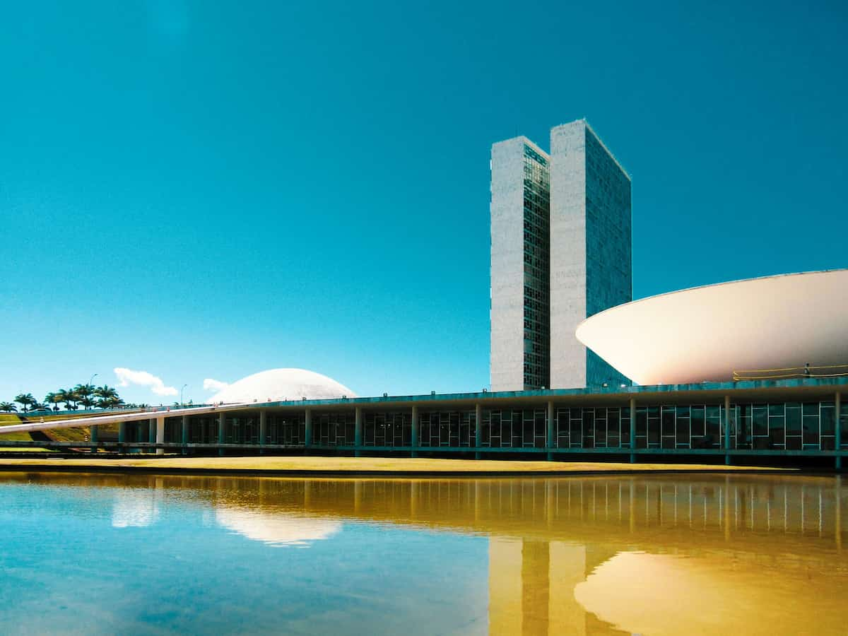
Brasília was envisaged as the dawn of a new Brazil. Purpose-built from the ground up on a pristine site in just 41 months, it attempted to remould and redefine what it meant to be Brazilian in its own logical, elegant, efficient image.
Brasília by Ramon Buçard on Unsplash
This style of large-scale urban planning is labeled high modernism by James C. Scott in his book Seeing Like A State. The same ethos and aesthetic can also be seen in the city of Chandigarh in India, which was designed by the modernist architect Le Corbusier.
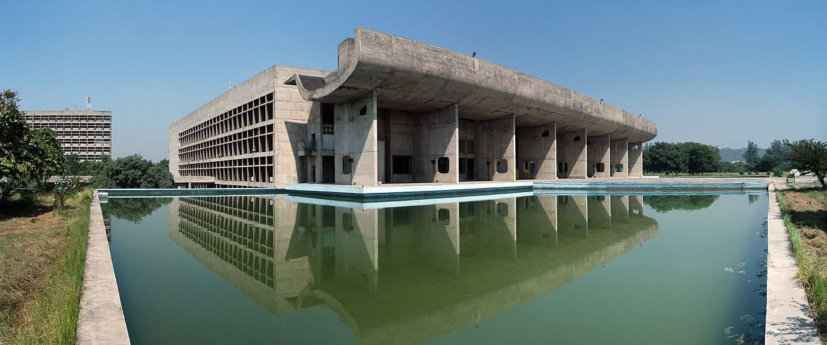
Palace of Assembly, Chandigardh
A darker form of high modernism is also to be found in Soviet collectivisation and in the forced displacement of peasants in Tanzania and Ethiopia during the 1970s.
The common thread in all of these examples is the attempt to formalize, systematize, and make legible and efficient. For a state, the primary concerns are that people can be counted and their activities quantified, inspected and controlled. Taxes must be collected, rebellions must be quashed, yields must be increased.
The aesthetic that typically accompanies this drive is one of rigid geometric regularity: round numbers, right angles, symmetry, elegance.
The problem that these schemes inevitably run into is the organic, spontaneous and emergent nature of human needs and culture, as well as the complex systems to which the right angle and round number are anathema.
Brasília and Chandigarh no doubt looked impressive as architectural drawings and models. Their aims were noble and even utopian. But what is it like to actually live there as a human being?
The UX sucked. Places that should be close were far. Public spaces were barren and uninviting. Streets were designed purely for efficient motorized transportation, with no thought given to their other uses as a meeting place, a space for play, for commerce. The city felt inhuman, unlivable.
Tanzanian farmers were forcibly relocated to neat geometric parcels of land which were too far from water sources or which had barren soil. Looked good on a central planner’s map, but the UX sucked.
The UX of living on a Soviet collective farm most certainly sucked, to put it mildly indeed.
High Modernism in Software
Much of the software we write has the express goal of inspecting, collecting, quantifying and enforcing. In many cases, these systems are the very tools of state systematization, inspection and control.
So it should come as no surprise that the designers of these systems often come from the same stock as the utopian high-modernist urban planner. The focus on elegance of form, the need to neatly label and group, the dismissal of illogical human concerns. Even the paternalistic attitude toward the end users of our creations. We’re smart! Of course this will be better than that ad-hoc inefficient hodgepodge you poor plebs are currently putting up with!
And even when not, the formal nature of software development pushes us in that direction - at some point a decision has to be made about what columns should be in the database schema!
Take names. The classic falsehoods programmers believe about names is an illustrative example.
Or timezones. Those petty human concerns make life for us developers so much harder. Wouldn’t it be so much easier if we did away with them? Oh. OK yeah maybe not.
Standing in testament to all of this is the general bad UX of almost all government IT systems. Moreover, the many collosal failures of grand IT schemes.
So too the un-killability of spreadsheet and note-taking software, which is like the digital expression of free-form, untamed, schema-less human endevour.
The writers of Little Britain summed it up perfectly in the phrase “computer says no”.

I’m not saying that it is right or good to keep sending PDFs and creating ad-hoc spreadsheets and having stuff scattered between 3 different notes apps and post-its stuck to the monitor. But until we really understand why they do, we’ll continue to have trouble coming up with anything better.